Overview
BA was driving its full digital estate to WCAG 2.1 AA. The flight selection page used by 50M+ customers a month had a structural problem: the patterns that helped sighted users compare flights were the same ones that broke screen reader and keyboard navigation. The cabin upsell module, a major revenue driver, had no accessible equivalent.
The problem
How might we make flight selection accessible without sacrificing the commercial outcomes that pay for the page?
TL;DR: the impact
A fully WCAG AA-compliant flight selection for 50M+ monthly users
Conversion and revenue: flat (within noise)
Cabin upsell: −3% — a behavioural gap I hadn't designed for
The miss reshaped how I now scope every commercial accessibility project
My contribution
Product design
Facilitation
Product strategy
User research
The team
1 × Product Manager
1 × Product Designer
3 × Engineers
Year
2023

Process
The constraint from day one: accessible and commercially neutral. "Compliant but worse-converting" wasn't shippable.
Three directions
The hardest tension was the price comparison pattern. Scannable for sighted users, hostile to assistive tech. I explored three options:
Linearised list with skip-links: most accessible, least scannable
Toggle pattern revealing one cabin at a time: middle ground, lower engineering risk
Rebuilt semantic grid: kept side-by-side comparison, highest cost
I prototyped option 2 and ran moderated usability testing. It tested cleanly and was feasible inside the quarter. In hindsight, this is where the cabin upsell drop was seeded.
Guardrails before launch
I wrote an experimentation brief naming what "winning" looked like before the build:
Conversion: no significant decrease
Revenue per session: no significant decrease
Cabin upsell: hold steady
Accessibility: pass WCAG AA
The first three were guardrails. The fourth was the goal.
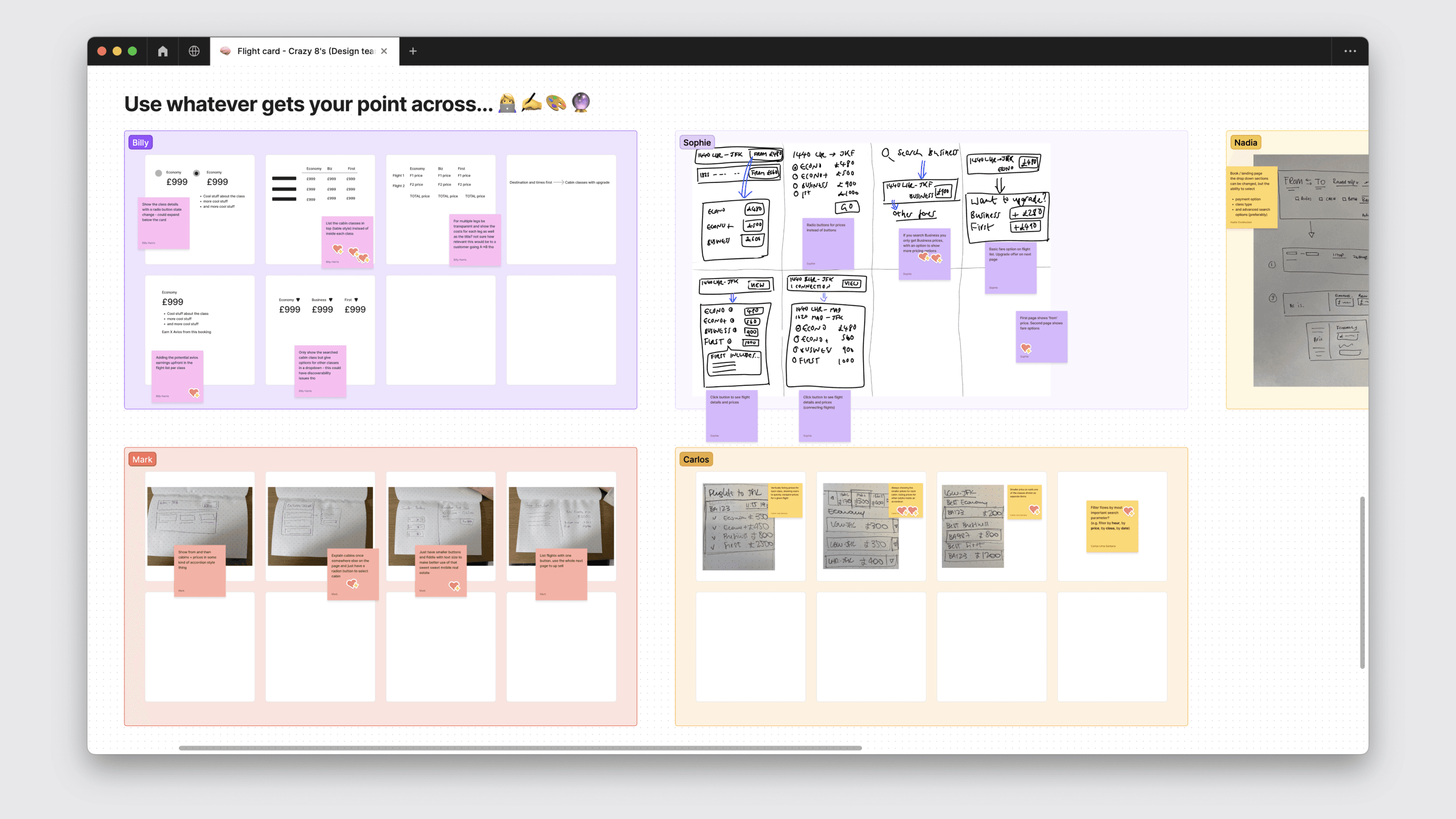
Crazy 8's exercise I facilitated with my product team to start ideating.

A view of the Figma variables I created.

A closer look at the screens that were created for a prototype.

A screenshot of the moderated user testing conducted.

A bento of the different design system elements.

A hero image of the final outcome.
Outcome
Results
Conversion: flat
Revenue per session: flat
Cabin upsell: −3% (statistically significant)
WCAG AA audit: passed
The toggle pattern hid cabins behind a control, removing the visual comparison that prompted "is the extra £80 worth it?" The accessibility win came at a measurable commercial cost.
What happened next
The follow-up didn't ship. The primary goal was achieved, the guardrails mostly held, and a −3% on a secondary metric wasn't enough to outweigh competing roadmap priorities. I was moved onto other work.
In retrospect, the skill I needed wasn't another design pass, it was translating the data into a roadmap argument leadership could act on. I didn't make that case strongly enough.
What I took forward
Accessible and commercial aren't usually opposed. When they appear to be, the pattern is wrong.
JTBD on commercial flows, not just user flows. "What is the customer hiring this page to do?" would have caught the comparison need.
Guardrails first in experimentation briefs. Name the KPIs to protect and the ones to trade before design starts.
Advocacy is part of the work. Senior design is doing the work and fighting for what should follow it.